This is an article I originally wrote for the Chartboost blog.
For the sake of brevity, we’re going to dub the next generation of web app development “Web 3.0.” This entails a collection of new technologies and new ideas, which have become possible only recently with the large advances made by modern browsers.
What does this mean? This means creating web applications, not sites. We believe the server side is a web service, while the client side is the application. The server provides an API, and the client is a self-contained app which uses this API. A mobile app would be an equal citizen and use the exact same API.
We think these ideas are the future, and as we grow our team and our capabilities, we are diving into them head first. The first of these projects—and somewhat of a testbed for what our dashboard is going to become—is none other than the new Chartboost Help site.
The help site.
So without further ado, these are some of the cool new things we’re trying with the new help site:
Push State
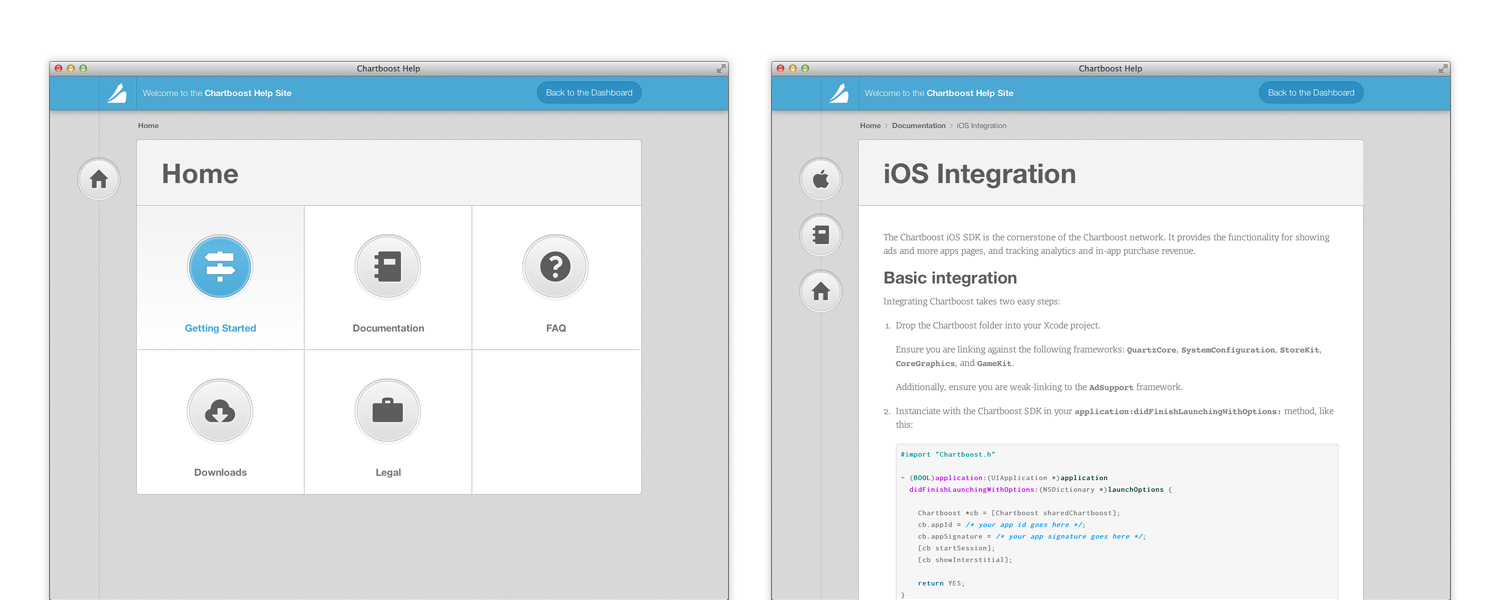
Perhaps the first thing you will notice is that navigating the site does not involve any page refreshes. Rather, this is done through a new technology called “Push State.” It lets a web app manipulate the browser history, essentially faking navigation and inserting its own JavaScript callbacks instead of reloads.
When moving between pages, the HTML is never replaced, which means that elements of the app can stay on screen, and even be animated, while the new content is being loaded. On the help site, a great example of this is the animation in the title part of the content, as well as the bouncing icons on the left.
This also makes the entire site feel more responsive and faster, since the user can be kept busy with animations, while a request to the server is happening in the background. That, and the requests are much smaller, since all that’s needed is the article content, and none of the layout or supporting files. Routing is done purely in JavaScript, and loading any URL natively from the server simply returns the same HTML file and routing code, which knows how to directly load the requested article.
JSON-API driven
This goes hand in hand with the above: now that we don’t require fully rendered HTML pages to be returned from the server, the server can now simply provide an elegant REST API. This API uses the full power of HTTP: versioning and authentication is done through headers, input is sent as JSON in the request body, and HTTP verbs are used.
Responsive
In an ever-connected world, and with the proliferation of mobile devices from smartphones to tablets, we think it’s becoming ever more important for the web to look its best on every device out there. Mobile-optimized sites just don’t cut it; a smartphone deserves to have the same full experience as a widescreen desktop computer.
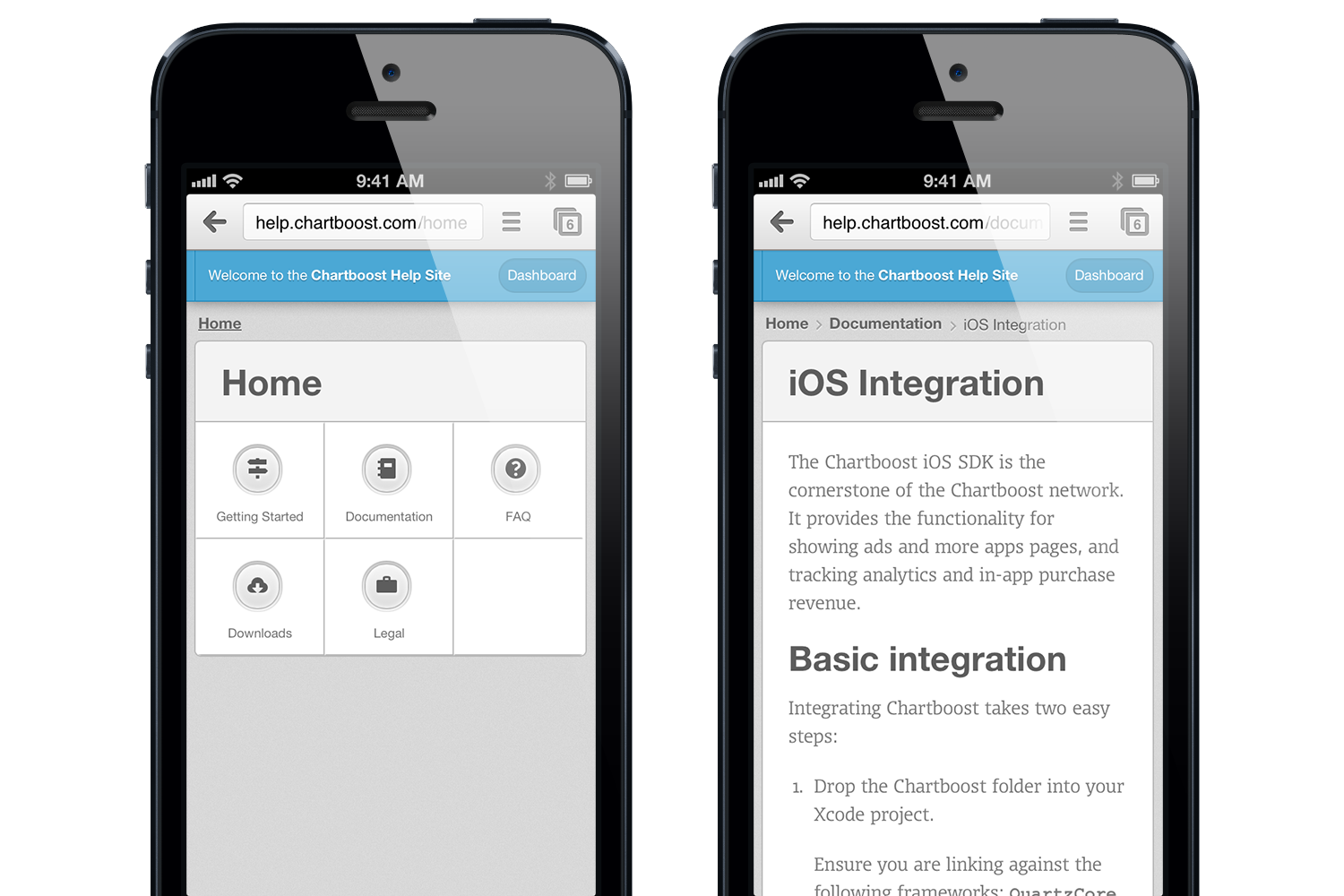
The help site, on an iPhone.
The help site, as well as this very blog, are responsive designs. They adjust and are fully functional on all devices from iPhone to Cinema Displays. To achieve that, we make use of CSS @media queries as well as rem and percent-based sizing. We used the Foundation framework for its built-in responsive grid.
Vector (Icon Fonts & CSS)
Another big recent change is the proliferation of “retina” (high-resolution) screens. They’ve been around for a while on iPhones, and are now expanding to Android devices, tablets, and computers. This is most commonly done by doubling the pixel-to-point ratio, and on iOS it is common to include double resolution assets by suffixing @2x to the image name.
We think, however, that for UI work, native rendering and vector are much better options than images. So for the help site, we use a combination of icon fonts and CSS3 properties to build up the entirety of the UI. There are practically no images in the help site’s UI!
SCSS
Another new technology we’ve made use of is CSS-preprocessing, through SCSS. This helps make our CSS code a lot cleaner and re-usable: using mixins (which are kind of like functions) for common prefixed properties, and variable dependencies on colors:
$button-green-one-textcolor : #FFFFFF;
$button-green-one-border : saturate(darken($primary-    color,11%), 1%);
$button-green-one-light-inset : #FFFFFF; /* Will be used inside an RGBA with opacity */
$button-green-bg-gradient-start : darken($primary-color, 1%);
$button-green-bg-gradient-end : saturate(lighten($primary-color, 7%), 7.5%);
You might have noticed that this blog and the new help site look similar. They actually share the same SCSS source, with only few differences, like the primary color being changes from blue to green. That, along with some other neat SCSS features like nesting allow for much cleaner and much more reusable CSS code.
Markdown
We believe the entire team should be able to write and edit help articles. Markdown is a fantastically simple markup language designed around the idea that it should look like plain text. A Markdown source file should be as readable as the output it produces; and indeed, it is far more natural to write in Markdown than HTML. Thus, our help articles are written in GitHub-flavored Markdown.
Since our documentation contains a fair amount of code samples, it was important for us to support GitHub-style code blocks, as well as native syntax highlighting. As a simple example, here is our iOS Integration article, and its source code.
GitHub
Help content, much like source code, is something that multiple people collaborate on, and which can benefit from versioning and branching. Instead of re-inventing the wheel ourselves, we decided to pick a tool we already use every day as a team: git and GitHub. The source code for all of our help articles (and its messy history) is all hosted publicly on our GitHub. Check it out! And who knows, maybe somebody will even send us a Pull Request at some point.
Design
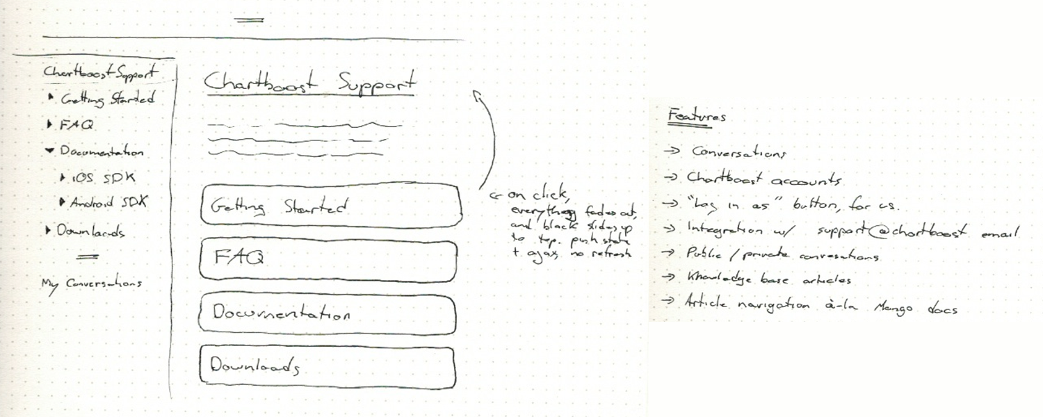
Original paper sketches
Going into it, we knew design was going to be a crucial part of this. What we had before really sucked, and was not up to our standard.

Alternate directions
We went through several iterations over a week, before settling on the current design.
We believe that the web is finally reaching a tipping point. The culmination of a decade of incremental improvements to web technologies is upon us, and lets us do things in a way that is radically new and better. If this is as exciting to you as it is to us, why don’t you throw us a line? We’re hiring!
(Source: chartboost)

Over the past week, I’ve quietly redesigned this blog to be somewhat up to my current standards. Before, I was using a customized version of Jake Paul’s theme, Solstice, which while attractive, was not my own work.
There were quite a few things I wanted to achieve with this redesign:
Most importantly, I wanted to have clear and easily legible typography on articles. This is, after all, a blog, and must serve its primary function above all. I also wanted to give myself a unique and somewhat more consistent personal brand, which I think this succeeds in doing.
I wanted the header to be a window into a photographic snapshot. It will be either selected randomly from a selection of my best shots, or updated on a semi-regular schedule. The end goal being: to push myself to take more and better photos, more often.
Lastly, I wanted to try to use some cool modern technologies and ideas. The header uses subtle parallax scrolling, which I think looks gorgeous. The styles is done in a LESS stylesheet, which makes coding CSS a breeze. I’m using semantic HTML 5 tags, like header and article, and using a few CSS3 animations. All in all, this was a fun and light coding exercise.
For a fun easter egg, click the little expand icon at the very top-left of any page.
Overall, I’m very satisfied with the result, but will no doubt keep tweaking it over time.
Credit where credit is due: I’ve drawn inspiration from many places, including: Sebastiaan de With, Dustin Curtis, and Hero's parallax header. I also used Andy Davies' pattern, light wool.
Macchiato
This past June, I attended my very first WWDC. The conference, the people and the parties were all amazing, and it was definitely a highlight. Inspired by the spirit of the conference, and all the new technologies presented, I set out to conquer my laziness and build and ship a new app.
I’m a huge fan of Markdown. So much so that I write nearly everything in it. From emails and notes, to documentation and blog posts. Unfortunately, writing Markdown meant one of two things for me: either launching TextEdit and switching it to plain text mode, or launching TextMate and writing in a code editor. Neither were really suited to the task.
To remedy this, I built Macchiato. I made full use of Lion’s new technologies. In fact, Macchiato only works on Lion. You’ve got full-screen mode, auto-save and versioning. The internals of the app uses NSRegularExpression, sandboxing, Automatic Reference Counting, and several other Lion-only APIs.
Macchiato is about being the very best at doing one thing: writing in Markdown. I’ve tried to keep an emphasis on usability, design and typography. I wanted to make it a joy to use, and for me it did the trick. I use it every day.
Check out Macchiato!

MongoModel is a simple and lightweight ORM for MongoDB and PHP. I finally got around to posting it on GitHub. It’s a simple piece of code, but it’s the backbone for many of my recent projects, including ChartBoost's entire backend.
The Azure License: Meaningful Attribution
I’m updating and re-releasing this from my old blog. Feel free to use the license in any project. No need to attribute me, the license itself is released into the public domain.
Open-source licensing can be a real pain. Some licenses are nearly impossible to decipher, while some (namely—the GNU GPL) are just pure evil.
I have been trying to find a software license which, like the Creative Commons Attribution license, would let the licensee do pretty much anything with the software, except it would require attribution in a meaningful way. That is to say, a non-intrusive mention in the documentation or about box.
The MIT license came closest to this, and it is the base on which the Azure License was written.
A good way to give attribution, as required by the license, would be a friendly “Contains code by Copyright Holder [linked]” or “Special thanks to Copyright Holder [linked]” in the about box.
The Azure License

Copyright (c) {Year} {Copyright Holder}

Attribute to {Copyright Holder} - {url}

You (the licensee) are hereby granted permission, free of charge,
to deal in this software or source code (this "Software") without
restriction, including without limitation the rights to use, copy,
modify, merge, publish, distribute, and/or sublicense this
Software, subject to the following conditions:

You must give attribution to the party mentioned above, by name and
by hyperlink, in the about box, credits document and/or
documentation of any derivative work using a substantial portion of
this Software.

You may not use the name of the copyright holder(s) to endorse or
promote products derived from this Software without specific prior
written permission.

THIS SOFTWARE IS PROVIDED "AS IS", WITHOUT WARRANTY OF ANY KIND,
EXPRESS OR IMPLIED, INCLUDING BUT NOT LIMITED TO THE WARRANTIES OF
MERCHANTABILITY, FITNESS FOR A PARTICULAR PURPOSE AND
NONINFRINGEMENT. IN NO EVENT SHALL THE AUTHORS OR COPYRIGHT HOLDERS
BE LIABLE FOR ANY CLAIM, DAMAGES OR OTHER LIABILITY, WHETHER IN AN
ACTION OF CONTRACT, TORT OR OTHERWISE, ARISING FROM, OUT OF OR IN
CONNECTION WITH THIS SOFTWARE OR THE USE OR OTHER DEALINGS IN THIS
SOFTWARE.

http://license.azuretalon.com/
If you’re a graphic designer, you’re probably familiar with canons of page construction. In book design, canons of page construction help you use aesthetically pleasing and balanced text block and margins. It has been used by many typographers throughout the ages, starting with the Gutenberg bible.
Constructing them, though, is somewhat of a pain. You have to go through a long series of steps, either in illustrator or by hand, constructing the text block geometrically. So I decided to write a small web app to do it automatically. Check it out online! Currently, only the most common canon is supported, but in the future I will add any canon I find the need to construct to the project.
If you’re more of a developer, I’ve open sourced the project on github under the Azure License.
iLaugh 2.9 is out!
iLaugh 2.9, in its Lite edition, is now out in the App Store, bringing to you a number of new features, fixes and enhancements.
Here’s what’s new:
- iOS 4.0 compatibility
- Multitasking and fast app switching support: When you come back to iLaugh, you’ll be taken right back to the joke you were reading before you left
- Now loads a lot faster due to additional caching
- Less promotional messages
- Better ads, leveraging Apple’s iAd network (to be launched July 1st)
- Various UI improvements
- Important bug fixes
Check for updates in iTunes – or if you haven’t yet, check out iLaugh!

iLaugh Premium is now available for the iPad.
When running on an iPad, it features a new interface thought out specifically for the iPad.
This version also fixes Facebook Share, for both iPhone and iPad.
Only the Premium edition has iPad support. There currently are no plans to bring the Lite edition to the iPad. So if you’ve been holding out for some great new features to buy the Premium edition, now is the time.
Check your updates, or if you don’t have iLaugh Premium yet, download it now!


